How to Choose the Right Paint Colors for Every Room in Your Home
Color is the hardest part of any paint job. Here's how to stop second-guessing yourself — and stop making the same mistakes everyone else makes.

Every week, someone calls me and says some version of the same thing: "We picked the color, painted the whole room, and now we hate it." Nine times out of ten, the color itself isn't wrong. The process for choosing it was.
I've been painting homes in Alpharetta, Roswell, Johns Creek, and Milton long enough to know that color selection is genuinely the hardest part of any interior paint project — not the prep, not the application. The color. And the mistakes are almost always the same ones, made in the same order.
So here's what I tell every client before we start talking swatches.
Start with the light in the room, not a paint fan deck
Natural light changes color more aggressively than most people expect. A soft greige that looks like warm linen in a south-facing showroom can read as flat gray in your north-facing study. A creamy white in bright afternoon sun can feel like a pale yellow by 7 PM under incandescent light.
Before you pick up a single swatch, spend a day paying attention to how light moves through the room. Morning vs. afternoon vs. evening. Note which direction the main windows face. If you have big windows with trees outside, the green bounce off the foliage will tint everything in that room — subtly but consistently.
North-facing rooms in particular — and we have a lot of them in the two-story homes spread across Alpharetta's newer subdivisions — read cooler because they rely on reflected, indirect light. Warm undertones help. Blues and cool grays fight you the whole way.
How do you actually pick a color that works? Test it big.
Paint a 12×12-inch swatch directly on the wall. Not a paint chip. Not a small sample card. A real painted swatch, on the actual wall, at least a foot square. Then look at it at three different times of day over two or three days before you commit.
Benjamin Moore's sample pots are $5–7 at most locations. Sherwin-Williams sells samples too. I've never understood why people will spend $1,800 on a paint job and skip the $14 of samples that would tell them exactly what they're getting into. Buy two or three candidates. Paint them next to each other on the same wall. The contrast will tell you more than any swatch comparison under fluorescent lights at the store.
One other thing: paint your sample over the current wall color, not over a white primer patch. The base coat matters more than most people think, and if you're repainting over a deep color, undertones will bleed through unless you're using a proper primer — something we always account for in our process.
Room by room: what actually works
Living rooms and open-plan spaces
These rooms do the most social work in the house, so the color needs to hold up through a dinner party and a Sunday morning. That means avoiding anything too aggressive or trend-forward. Warm neutrals — greiges, soft whites, warm taupes — have staying power for a reason.
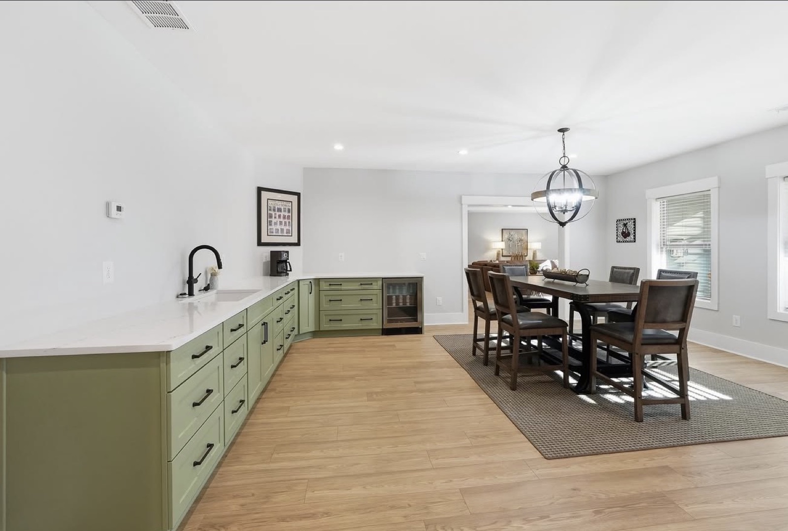
In open floor plans, which describe about 70% of the homes we paint in Johns Creek and Alpharetta, color continuity matters. You don't need everything the same color, but you need the colors to be in the same family or have intentional contrast. Where I see it go wrong most often is when someone picks a living room color and a kitchen color independently, without holding them up next to each other.
Benjamin Moore's Revere Pewter is a classic for a reason — a warm greige that shifts with the light rather than fighting it. For something warmer, Pale Oak works beautifully in high-ceiling two-stories. Both hold up in Georgia light without going orange or flat.
Bedrooms
Sleep rooms benefit from colors that don't stimulate. Blues, soft greens, warm whites, lavenders in small doses. The research on blue bedrooms and sleep quality is real enough to take seriously.
What I caution against in bedrooms: going too dark just because it "looks dramatic in photos." A deep navy accent wall photographs beautifully and feels oppressive at 7 AM. If you love deep color, consider a single accent wall and keep the other three walls lighter — the effect reads rich without shrinking the room.
Kitchens
Kitchens work against you in two ways: they have more fixed elements than any other room (cabinets, countertops, backsplash, appliances, hardware), and they often have a mix of natural and artificial light that creates a complicated color environment.
My honest advice: don't pick your kitchen wall color first. Pick it last. Look at the undertones in your countertop, the finish on your cabinets, the grout in your backsplash — and work from there. Whites and soft neutrals win in kitchens almost every time because they don't compete. If you want personality in the kitchen, put it in the cabinets, not the walls. Which is a good segue into why cabinet refinishing is one of the most high-ROI projects a homeowner can do.
Bathrooms and small spaces
Small bathrooms are the one place where going bold is lower risk. The room is contained. If you regret it, it's a half-day of work to repaint. I've seen a 6×8 powder bath in a gorgeous deep forest green stop guests in their tracks.
The other thing about small bathrooms: light-colored doesn't necessarily mean larger-feeling. A room with consistent, saturated color and good trim contrast can actually feel more intentional — and therefore bigger — than the same room painted a flat white with no contrast.
Home offices
With so many North Atlanta homeowners working from home, this is a room that deserves more thought than it usually gets. You need a color that supports focus without being boring, and that holds up well under video calls.
Greens and warm blues consistently perform well here — calming without being sleepy. Avoid warm oranges and yellows, which can be energizing in the morning but fatiguing over a long day. And pay attention to how the color reads on camera; anything too saturated creates a distracting background in video calls.
What about trim, ceilings, and the whole picture?
Wall color is only part of the equation. Trim and ceilings do more quiet work than most people give them credit for.
Trim: Bright white trim against a warm wall color creates crisp contrast that makes the wall color read more intentional. But bright white trim next to a cool gray wall can go clinical. In those cases, an off-white with just a whisper of warmth softens everything down.
Ceilings: The rule "ceiling color = lightest value of the wall color" holds up most of the time. It keeps the color family consistent and makes the ceiling feel higher than a stark white would in a room with saturated walls. The exception is very light wall colors — there, white ceilings are fine and even preferable.
The fifth wall problem: In rooms with lots of architectural detail — coffered ceilings, deep crown molding, wainscoting — the ceiling and trim become a bigger design element. If that describes your space, I'd genuinely suggest working with someone who does specialty finishes before committing to a palette. The decisions interconnect in ways that are hard to visualize off a fan deck.
A word on color trends
Follow trends for inspiration. Don't follow them for decisions. The deep terracottas and moody greens everywhere right now will be dated in five years, and "just repaint it" is an annoying non-answer if you're painting a house to sell or live in long-term.
That said — if you love it and it's your home, paint the terracotta. Just know what you're signing up for. Our transferable warranties are 7 years on exteriors and 6 months on interiors, but no warranty covers "I changed my mind about the color." Paint it because it makes you happy, not because a Pinterest board told you it was the moment.
Should you hire a color consultant?
For straightforward repaints — refreshing existing colors, going a shade lighter or darker — probably not necessary. For major whole-home repaints, significant renovations, or spaces with complex architecture, a color consultant is often worth the $200–400 fee. Benjamin Moore and Sherwin-Williams both offer color consultation services.
What a good consultant gives you isn't just colors — it's confidence. Making a $4,000 paint decision with uncertainty is worse than spending $300 to eliminate that uncertainty. We can guide clients through the selection process as part of our pre-project process, because we've seen enough North Atlanta homes to have strong opinions about what works here specifically.
Before you commit to a color, run this
The five-minute version of everything above:
- ✓Watch how light moves through the room — morning, afternoon, and evening — before you shop.
- ✓Buy 2–3 sample pots and paint foot-square swatches on the actual wall, over the existing color.
- ✓Look at them at three different times of day across two or three days.
- ✓Keep undertones in the same family — warm with warm, cool with cool — across connected rooms.
- ✓Pick kitchen and bath colors last, working off the fixed finishes already in the room.
Spend the $14 on samples before the $1,800 on paint. It's the cheapest insurance in the whole project.
Ready to stop guessing?
We walk every client through color selection as part of our process — no extra charge, no pressure. We've seen enough North Atlanta homes to know what holds up in this light, and we'd rather spend the time up front than watch you live with a color you settled on.
Not sure which color?
Get a free, no-pressure on-site estimate — and a color walkthrough built into our process. We'll reach out within one business day.
Frequently Asked Questions
How many paint colors should a house have?
Can you paint a dark room lighter to make it feel bigger?
What's the best white paint for walls in Georgia homes?
How do you match paint colors between rooms?
Does paint color affect home resale value in North Atlanta?